Have you ever seen this meme? 🤣
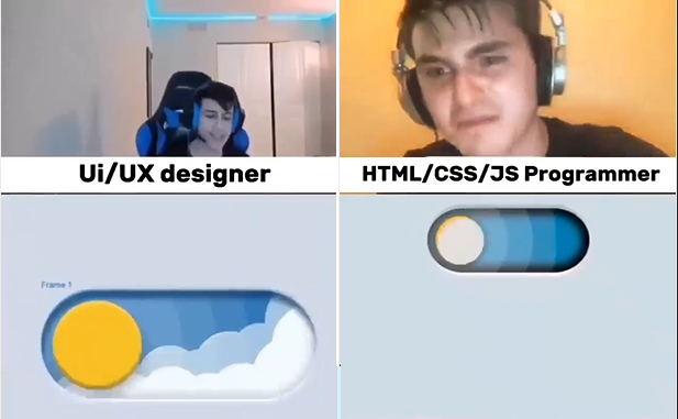
Here's the full video: The key contrast between UI/UX Designers and Developers is...
After watching this, I had the idea to attempt doing the UI in the video myself. Guess what, I was successful. Yay! 🎉🥳 And now I want to share it with you. 🔥
What we're going to use?
- Tailwind
- React
- Star Image: Download here
- Change the color to white
Let's Start!
The toggle shape: Lets start by shaping our toggle button
- Currently here's what we got:
import React from "react";
const Toggle = () => {
  return <div>Toggle</div>;
};
export default Toggle;
- Let's add basic styles:
import React from "react";
const Toggle = () => {
  return (
    <div className="relative rounded-full w-[90px] h-[45px] p-2 box-border border-4"></div>
  );
};
export default Toggle;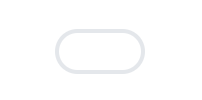
- Add shadows
import React from "react";
const Toggle = () => {
  return (
    <div className="relative rounded-full w-[90px] h-[45px] p-2 box-border cursor-pointer shadow-[inset_0px_3px_3px_#100e2b61,inset_0px_-2px_3px_#e3e3e3]"></div>
  );
};
export default Toggle;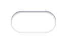
That's it! We now have the basic shape of the toggle. Now let's talk about how I see the toggle's waves...
Waves:
In this section we have three tasks:
- How to make the waves itself?
- How to change the directions of waves?
- How do we change the color of the waves depending on the state of the toggle?
Solving Task 1
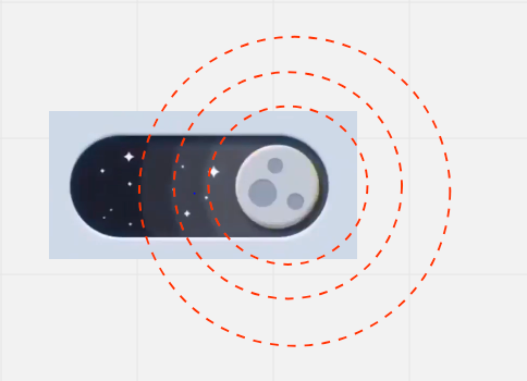
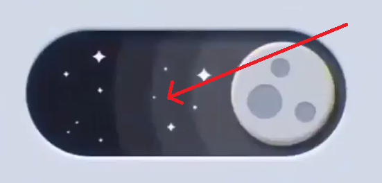
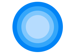
The first time I saw the meme video above, I noticed that the waves are actually circles.Here's how I see it:
Solving Task 2
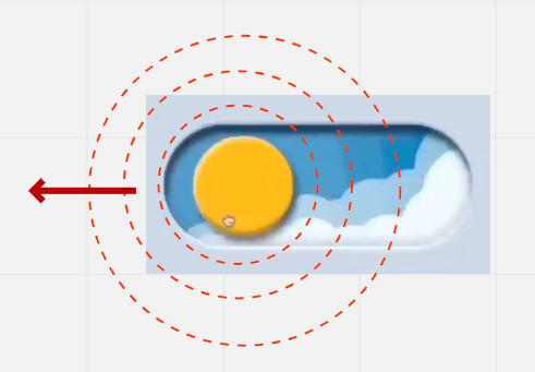
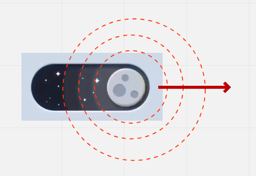
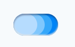
Now, how to do we change the direction of waves? As I mentioned earlier the waves are just cirles, so all we have to do is move the circles from left to right to changed its direction.When the state is light mode:
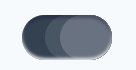
 When the state is Dark mode:
Solving Task 3
If you watch the video above you notice that colors of the waves are changing depending on the state of the toggle.Figure 1: Waves are shaded with blue(s)
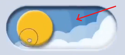 Figure 2: Waves are shaded with black(s)
Now that we have the necessary idea.
Let's make our hands dirty 🔥Coding Task 1: Creating circles
- Create a file called
Waves.jsxand import it toToggle.jsx
Waves.jsx
import React from "react";

const Waves = () => {
  return (
    <div className={`absolute top-0 h-full w-[70px] flex items-center justify-center`}>
      <span className={`absolute h-[170px] w-[170px] rounded-full bg-blue-500`}></span>
      <span className={`absolute h-[140px] w-[140px] rounded-full bg-blue-400`}></span>
      <span className={`absolute h-[110px] w-[110px] rounded-full bg-blue-300`}></span>
      <span className={`absolute h-[80px] w-[80px] rounded-full bg-blue-200`}></span>
    </div>
  )
}

export default Waves
Toggle.jsx
// imports...
import Waves from "Waves.jsx";
const Toggle = () => {
  return (
    <div className="relative rounded-full w-[90px] h-[45px] p-2 box-border cursor-pointer shadow-[inset_0px_3px_3px_#100e2b61,inset_0px_-2px_3px_#e3e3e3]">
      <Waves />
    </div>
  )
}
// export...
Now our components looks like this:
As you can see the waves are blocking the main toggle container.
Let's addoverflow-hiddenclass to our main toggle container to hide the unnecessary part of the circles.// Updated Toggle.jsx import React from 'react' import Waves from './Waves' const Toggle = () => { return ( <div className="relative rounded-full w-[90px] h-[45px] p-2 box-border cursor-pointer overflow-hidden shadow[inset_0px_3px_3px_#100e2b61,inset_0px_-2px_3px_#e3e3e3]"> <Waves /> </div> ) } export default ToggleNow our components looks like this:
Coding task 2: Changing the direction of the waves.
- Now that we have the waves, all we need to do is to move it from left to right(and vice versa) by adding
-translate-x-1/2ortranslate-x-1/2classes.
Let's implement it by adding
modestate in our main toggle component.Toggle.jsx
// imports...
const Toggle = () => {
  const [mode, setMode] = React.useState("light");

  return (
    <div
      // ... other prop
      onClick={() => {
        setMode(prevMode => prevMode === "light" ? "dark" : "light")
      }}
    >
      <Waves mode={mode} />
    </div>
  )
}
// export...
Here we added
onClickfunction in our main container and passed themodestate in theWaves.jsxcomponent.Waves.jsx
  // imports...

  const Waves = ({ mode }) => {
  return (
    <div className={`
      // other classes...
      ${mode === "light" ? "-translate-x-1/2" : "translate-x-1/2"}
    `}>
      // waves...
    </div>
  )
}

// export...
Here we used the
modeprops to determine the direction of waves.Now we can toggle between light and dark by clicking the toggle
Coding Task 3: Changing the color of the waves. Now that we have the
modestate we can use it to determine what should be the color of the waves.Waves.jsx
// imports...

const Waves = ({ mode }) => {
  return (
    <div //...props>
      <span className={`// other clases...
      ${mode === "light" ? "bg-blue-500" : "bg-gray-700"}`}></span>
      <span className={`// other clases...
      ${mode === "light" ? "bg-blue-400" : "bg-gray-700"}`}></span>
      <span className={`// other clases...
      ${mode === "light" ? "bg-blue-300" : "bg-gray-600"}`}></span>
      <span className={`// other clases...
      ${mode === "light" ? "bg-blue-200" : "bg-gray-500"}`}></span>
    </div>
  )
}
// export...
Here we change the shades of the waves from blue to black depending on the value of the
mode.light mode:
Dark mode:
Current Toggle.jsx
import React from 'react'
import Waves from './Waves'

const Toggle = () => {
const [mode, setMode] = React.useState("light");

return (
    <div className="relative rounded-full w-[90px] h-[45px] p-2 box-border cursor-pointer overflow-hidden shadow-[inset_0px_3px_3px_#100e2b61,inset_0px_-2px_3px_#e3e3e3]"
      onClick={() => {
        setMode(prevMode => prevMode === "light" ? "dark" : "light")
      }}
    >
      <Waves mode={mode} />
    </div>
  )
}

export default Toggle
Current Waves.jsx
import React from "react"; const Waves = ({ mode }) => { return ( <div className={`absolute top-0 h-full w-[70px] flex items-center justify-center z-negative ${mode === "light" ? "-translate-x-1/2" : "translate-x-1/2"}`}> <span className={`absolute h-full w-[170px] rounded-full ${mode === "light" ? "bg-blue-500" : "bg-gray-700"}`}></span> <span className={`absolute h-full w-[140px] rounded-full ${mode === "light" ? "bg-blue-400" : "bg-gray-700"}`}></span> <span className={`absolute h-full w-[110px] rounded-full ${mode === "light" ? "bg-blue-300" : "bg-gray-600"}`}></span> <span className={`absolute h-full w-[80px] rounded-full ${mode === "light" ? "bg-blue-200" : "bg-gray-500"}`}></span> </div> ) } export default Waves- How to make the waves itself?
Sun and moon: Now lets take a look at these bad boys (sun and moon)
In this section we split our task into three
- Designing sun and moon.
- How to hide the moon inside the sun?
- How to position sun/moon?
Solving Task 1 Now lets create a
Sun.jsxandMoon.jsxfiles and import it to the main toggle container.Sun.jsx
import React from 'react'

const Sun = () => {
  return (
    <div>Sun</div>
  )
}

export default Sun
Moon.jsx
import React from 'react'

const Moon = () => {
  return (
    <div>Moon</div>
  )
}

export default Moon
Toggle.jsx
// other imports...
import Sun from './Sun';
import Moon from './Moon';

const Toggle = () => {
  // states...
  return (
    <div /* other props... */ />
      <div className="relative top-1/2 -translate-y-1/2 rounded-full h-full w-[30px] overflow-hidden shadow-[3px_5px_7px_-4px_#000000eb] z-30 left-0">
        <Sun />
        <Moon />
      </div>
      // other components...
    </div>
  )
}
// export...
Notice the we added a wrapper
divelement that holdssunandmoonthis is to help us to position them correctly.Let's start by adding the necessary classes in
Sun.jsximport React from 'react' const Sun = () => { return ( <span className="absolute bg-yellow-400 h-full w-full rounded-full shadow-[inset_1px_1px_1px_#ffffff94,inset_-1px_-1px_1px_#00000057]"></span> ) } export default SunNow our
Sun.jsxis done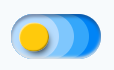
Next, Let's build the
Moon.jsximport React from 'react' const Moon = () => { return ( <div className={`absolute bg-gray-200 h-full w-full rounded-full shadow-[inset_1px_1px_1px_#ffffff94,inset_-1px_-1px_1px_#00000057]`}> <span className="absolute left-1.5 bottom-1.5 rounded-full h-[10px] w-[10px] bg-gray-400 shadow-[inset_1px_1px_2px_#0000005c]"></span> <span className="absolute left-3.5 bottom-5 rounded-full h-[5px] w-[5px] bg-gray-400 shadow-[inset_1px_1px_2px_#0000005c]"></span> <span className="absolute left-5 bottom-2 rounded-full h-[6px] w-[6px] bg-gray-400 shadow-[inset_1px_1px_2px_#0000005c]"></span> </div> ) } export default MoonHere's the
Moon.jsx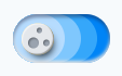
Solving Task 2
If you watch the meme video carefully you may see that the moon is showing from inside the sun. Like this: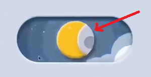 This is simple to do actually, we just need to position the moon at the very right position: Let's add the
 translate-x-fullclass to do it.Moon.jsx
const Moon = () => { return ( <div className={`other classes... translate-x-full`}> // moon spots... </div> ) }Now the moon is hidden inside the sun. Next step is to show the moon when the
modestate is turned into dark.To do this we need to pass the
modestate inside theMooncomponentMoon.jsx
const Moon = ({ mode }) => { return ( <div className={`/* other classes... */ ${mode === "light" ? "translate-x-full" : "translate-x-0"}`} > // moon spots... </div> ) }Now we can determine whether to show moon or sun by clicking the toggle container.
Solving Task 3
The only thing that we're missing here is the correct position of sun/moon. To do this let's open theToggle.jsxand change the position of wrapperdiv(that holds the sun/moon) depending on themodestate.Toggle.jsx
// imports... const Toggle = () => { const [mode, setMode] = React.useState("light"); return ( <div /* props... */> <div className={`/* other classes... */ {mode === "light" ? "" : "translate-x-[150%]"}`}> <Sun /> <Moon mode={mode} /> </div> // other components... </div> ) }Now we're finished in this section. Here's the final code for
Moon.jsx,Sun.jsxandToggle.jsx.Sun.jsx
import React from 'react' const Sun = () => { return ( <span className="absolute bg-yellow-400 h-full w-full rounded-full shadow-[inset_1px_1px_1px_#ffffff94,inset_-1px_-1px_1px_#00000057]"></span> ) } export default SunMoon.jsx
import React from 'react'
const Moon = ({ mode }) => {
  return (
    <div className={`absolute bg-gray-200 h-full w-full rounded-full shadow-[inset_1px_1px_1px_#ffffff94,inset_-1px_-1px_1px_#00000057]
    ${mode === "light" ? "translate-x-full" : "translate-x-0"}`}>
    <span className="absolute left-1.5 bottom-1.5 rounded-full h-[10px] w-[10px] bg-gray-400 shadow-[inset_1px_1px_2px_#0000005c]"></span>
    <span className="absolute left-3.5 bottom-5 rounded-full h-[5px] w-[5px] bg-gray-400 shadow-[inset_1px_1px_2px_#0000005c]"></span>
    <span className="absolute left-5 bottom-2 rounded-full h-[6px] w-[6px] bg-gray-400 shadow-[inset_1px_1px_2px_#0000005c]"></span>
  </div>
  )
}

export default Moon
Toggle.jsx
import React from 'react'
import Waves from './Waves'
import Sun from './Sun';
import Moon from './Moon';

const Toggle = () => {
  const [mode, setMode] = React.useState("light");

  return (
    <div className="relative rounded-full w-[90px] h-[45px] p-2 box-border cursor-pointer overflow-hidden shadow-[inset_0px_3px_3px_#100e2b61,inset_0px_-2px_3px_#e3e3e3]"
      onClick={() => {
        setMode(prevMode => prevMode === "light" ? "dark" : "light")
      }}
    >
      <div className={`relative top-1/2 -translate-y-1/2 rounded-full h-full w-[30px] overflow-hidden shadow-[3px_5px_7px_-4px_#000000eb] z-30 left-0 ${mode === "light" ? "" : "translate-x-[150%]"}`}>
        <Sun />
        <Moon mode={mode} />
      </div>
      <Waves mode={mode} />
    </div>
  )
}

export default Toggle
Clouds and Stars: In this section we will create the most awesome part in this component.
Just like the other sections above, will will divide this task into two:
- Creating the clouds and stars.
- How to position the clouds and stars?
Solving Task 1
If you notice, the way that clouds and stars are transitioning from each other is by moving up and down.Here's how I see it:
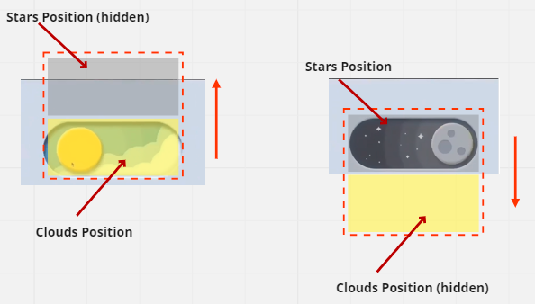 Clouds and Stars Figure 1
Notice that there are two different sections (top and bottom), top holds the stars and bottom holds the clouds. To hide the stars all we need to do is move the container at the top, and to hide the clouds what need to do is move the container at the bottom.
Now that we have the idea lets apply it to the code.
Let's create the Clouds and Stars. To do this we need to create
Clouds.jsxandStars.jsxfiles.Let's start with the
Clouds.jsximport React from 'react' const Clouds = () => { return ( <div className="relative h-1/2 w-full"> <span className="absolute bg-blue-100 h-[30px] w-[30px] rounded-full -right-2"></span> <span className="absolute bg-blue-100 h-[20px] w-[20px] rounded-full top-4 right-3"></span> <span className="absolute bg-blue-100 h-[30px] w-[30px] rounded-full top-5 right-4"></span> <span className="absolute bg-blue-100 h-[20px] w-[20px] rounded-full top-7 right-8"></span> <span className="absolute bg-blue-100 h-[30px] w-[30px] rounded-full top-7 right-10"></span> <span className="absolute bg-blue-100 h-[20px] w-[20px] rounded-full -bottom-1 left-1"></span> <span className="absolute bg-slate-50 h-[30px] w-[30px] rounded-full top-2 -right-4"></span> <span className="absolute bg-slate-50 h-[20px] w-[20px] rounded-full top-6 right-0"></span> <span className="absolute bg-slate-50 h-[20px] w-[20px] rounded-full -bottom-3 right-3"></span> <span className="absolute bg-slate-50 h-[20px] w-[20px] rounded-full -bottom-4 right-6"></span> <span className="absolute bg-slate-50 h-[30px] w-[30px] rounded-full -bottom-5 right-9"></span> <span className="absolute bg-slate-50 h-[35px] w-[35px] rounded-full -bottom-7 left-0"></span> </div> ) } export default CloudsNext,
Stars.jsxStars.jsx
import React from 'react'

const Stars = () => {
  return (
    <div className="relative h-1/2 w-full">
      <img className="absolute top-2 left-3.5" alt="star" src="icons8-star-24.PNG" width={8} height={8} />
      <img className="absolute top-4 left-1.5" alt="star" src="icons8-star-24.PNG" width={4} height={4} />
      <img className="absolute top-6 left-4" alt="star" src="icons8-star-24.PNG" width={3} height={3} />
      <img className="absolute bottom-2 left-3" alt="star" src="icons8-star-24.PNG" width={1} height={1} />
      <img className="absolute bottom-1 left-5" alt="star" src="icons8-star-24.PNG" width={1} height={1} />

      <img className="absolute top-3 left-8" alt="star" src="icons8-star-24.PNG" width={1} height={1} />
      <img className="absolute top-5 left-7" alt="star" src="icons8-star-24.PNG" width={1} height={1} />
      <img className="absolute bottom-2 left-8" alt="star" src="icons8-star-24.PNG" width={4} height={4} />
      <img className="absolute bottom-4 left-10" alt="star" src="icons8-star-24.PNG" width={1} height={1} />

      <img className="absolute top-3 left-10" alt="star" src="icons8-star-24.PNG" width={8} height={8} />
    </div>
  )
}

export default Stars
Solving Task 2
Next, let's update the main toggle container.
Toggle.jsx
// imports...
const Toggle = () => {
  const [mode, setMode] = React.useState("light");

  return (
    <div /* props */ >
      <div /* props */ >
      // sun and moon
      </div>
      <div className={`absolute h-[200%] w-full left-0 -top-[100%]`}>
      // Clouds and Stars...
      </div>
      // waves
    </div>
  )
}
Here we added the container divs. It will help up to position the clouds and stars later.
Next Step is to position the clouds and stars correctly depending on the
modestate.Toggle.jsx
// imports

const Toggle = () => {
  const [mode, setMode] = React.useState("light");

  return (
    <div /* props */ >
      <div /* props */ >
        // Sun & Moon
      </div>
      <div className={`absolute h-[200%] w-full left-0 -top-[100%] ${mode === "light" ? "translate-y-0" : "translate-y-1/2"}`}>
        // ...
      </div>
      /* Waves */
    </div>
  )
}

export default Toggle
Next, Let's add the Stars and Clouds.
Toggle.jsx
  // other imports...
  import Stars from "Stars.jsx";
  import Clouds from "Clouds.jsx";

  const Toggle = () => {
    const [mode, setMode] = React.useState("light");

    return (
      <div /* props */ >
        <div /* props */ >
          // Sun & Moon
        </div>
        <div className={`absolute h-[200%] w-full left-0 -top-[100%] ${mode === "light" ? "translate-y-0" : "translate-y-1/2"}`}>
          <Stars />
          <Clouds />
        </div>
        /* Waves */
      </div>
    )
  }
Now we can toggle the visibility of stars or clouds.
Current Toggle.jsx
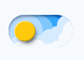
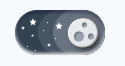
import React from 'react'
import Waves from './Waves'
import Sun from './Sun';
import Moon from './Moon';
import Stars from './Stars';
import Clouds from './Clouds';

const Toggle = () => {
  const [mode, setMode] = React.useState("light");

  return (
    <div className="relative rounded-full w-[90px] h-[45px] p-2 box-border cursor-pointer overflow-hidden shadow-[inset_0px_3px_3px_#100e2b61,inset_0px_-2px_3px_#e3e3e3]"
      onClick={() => {
        setMode(prevMode => prevMode === "light" ? "dark" : "light")
      }}
    >
      <div className={`relative top-1/2 -translate-y-1/2 rounded-full h-full w-[30px] overflow-hidden shadow-[3px_5px_7px_-4px_#000000eb] z-30 left-0 ${mode === "light" ? "" : "translate-x-[150%]"}`}>
        <Sun />
        <Moon mode={mode} />
      </div>
      <div className={`absolute h-[200%] w-full left-0 -top-[100%] ${mode === "light" ? "translate-y-0" : "translate-y-1/2"}`}>
        <Stars />
        <Clouds />
      </div>
      <Waves mode={mode} />
    </div>
  )
}

export default Toggle
Here's what we created so far:
Day mode
 Dark mode
Transitions: Something's missing right?
- All we need to do in this section add the necessary transition to our component.
Luckily, we just need to this classes
transition duration-700 ease-in-out.
Waves.jsx
const Waves = ({ mode }) => {
  return (
    <div className={`/* other classes... */ transition duration-700 ease-in-out`}>
      // Waves...
    </div>
  )
}
Moon.jsx
const Moon = ({ mode }) => {
  return (
    <div className={`/* other classes... */ transition duration-700 ease-in-out`}>
    // Spots...
    </div>
  )
}
Toggle.jsx
In this file we need to add those classes in two places, first in the container of the sun and moon. Next, we also need to add it to the container of stars and clouds.
// imports...
const Toggle = () => {
  const [mode, setMode] = React.useState("light");

  return (
    <div /* props */ >
      <div className={`/* other classes... */ transition duration-700 ease-in-out`}>
        // Sun and Moon
      </div>
      <div className={`/* other classes... */ transition duration-700 ease-in-out`}>
        // Stars and Clouds
      </div>
      // Waves...
    </div>
  )
}
Pew! Thats it, thanks for reading.
- All we need to do in this section add the necessary transition to our component.
Luckily, we just need to this classes