In this post I'll explain the behavior of each individual position type in css:
- Static
- Relative
- Absolute
- Fixed
Okay, let's start!
First let's create a file called position.html and paste the code below in it, and open the file in a browser.
<!DOCTYPE html>
<html lang="en">
<head>
<meta charset="UTF-8" />
<meta http-equiv="X-UA-Compatible" content="IE=edge" />
<meta name="viewport" content="width=device-width, initial-scale=1.0" />
<title>CSS Positions</title>
<style>
body {
font-family: sans-serif;
padding: 100px;
}
.grand-parent {
position: static;
top: 500px;
}
</style>
</head>
<body>
<div class="grand-parent">
<div class="parent">
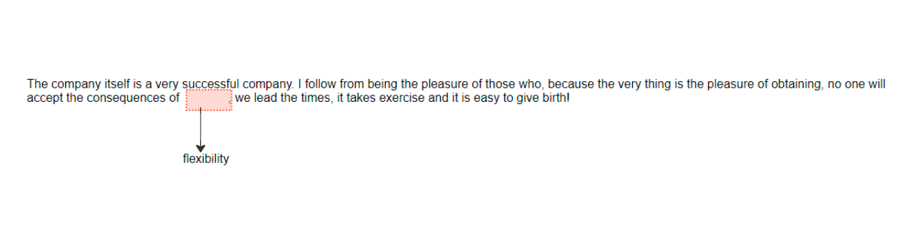
The company itself is a very successful company. I follow from being the pleasure of those who, because the very thing is the pleasure of obtaining, no one will accept the consequences of <span class="child">flexibility</span>, we lead the times, it takes exercise and it is easy to give birth!
</div>
</div>
</body>
</html>Static Position
- Okay, let's talk about the position type that you always used, it is the position
static. - If you add directional properties (
top,right,bottom,left) in an element that is positioned static, you'll notice that those properties will not work. It is becausestaticposition type, position itself in the natural flow of elements. - And also, the reason I say that you'll use
staticposition the most is because it is the default position of every html element.
Let's try adding static position and directional property in
grand-parentclass<head> // meta data ... <title>CSS Positions</title> <style> body {...} .grand-parent { position: static; top: 500px; } </style> </head> <body> ... </body>Now if we refresh the browser, nothings really happen! But as soon as you change the position type to (let say, position
relative) you'll see that the directional property starts to work as expected.With that said, let's take a look at the position
relative- Okay, let's talk about the position type that you always used, it is the position
Relative Position
- So,
relativeis another positioning statement that you'll use quite often. - In relative position we have to really be aware of where things currently are and how they flow together.
Ok, to give you an example let's apply
relativeposition and directional properties in the class calledchild.<head> // meta data ... <title>CSS Positions</title> <style> body {...} .child { position: relative; top: 80px; } </style> </head> <body> ... </body>- When you refresh the page, one thing you'll notice is the directional properties starts working as expected.
Next, if you look carefully, you'll see that the natural flow of the other html elements are still respecting the area of .child class
- So,
Absolute Position
To start, let's declare an absolute position in
childclass.<head> // meta data ... <title>CSS Positions</title> <style> body {...} .child { position: absolute; } </style> </head> <body> ... </body>You'll notice that the other html elements doesn't respect the area of
childclass anymore, that is because when you absolutely position an element the effect of it(in terms of area/dimension) are removed outside of the DOM and the elements around it flows as if it wasn't there.
We still don't apply any directional property yet, so by default its
auto. But let's try addingtopproperty to thechildclass element, and see what will happen.<head> // meta data ... <title>CSS Positions</title> <style> body {...} .child { position: absolute; background: lime; top: 0; } </style> </head> <body> ... </body>I also added background color so we can easily see where the
.childelement is.
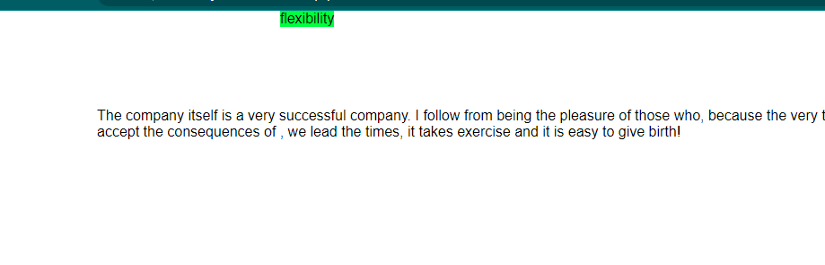
- Notice that the
.childelement jumps all the way to the top of the window. - Now why is it? It is because when you declare an
absoluteposition to an element, it will be positioned relative to its nearest parent with a declared position. If you don't have one, it will be positioned relative to document, that's why when we declare atopproperty to.childelement it jumps to the top of the window. Just to test that statement let's now add a position statement to the
.grand-parentelement.<head> // meta data ... <title>CSS Positions</title> <style> body {...} .child {...} .grand-parent { position: relative; background: lightgray; padding: 20px; } </style> </head> <body> ... </body>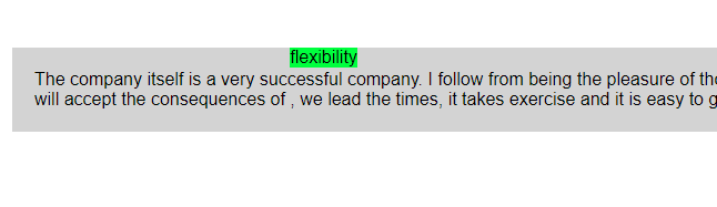
I also added
background-colorandpaddingto the.grand-parentelement so we can see easily its dimension.Notice that as soon as we add a
position: relative;to the.grand-parentelement, the.childelement position itself relative to it because it is the nearest parent we a declared position statement.
Fixed Position
Before we jump into the
fixedposition, let's update our html file first.<!DOCTYPE html> <html lang="en"> <head> <meta charset="UTF-8" /> <meta http-equiv="X-UA-Compatible" content="IE=edge" /> <meta name="viewport" content="width=device-width, initial-scale=1.0" /> <title>CSS Positions</title> <style> body { font-family: sans-serif; padding: 100px; } .child { position: fixed; background: lime; } .grand-parent { position: relative; background: lightgray; padding: 20px; } .tall-container { height: 100vh; } </style> </head> <body> <div class="grand-parent"> <div class="parent"> The company itself is a very successful company. I follow from being the pleasure of those who, because the very thing is the pleasure of obtaining, no one will accept the consequences of <span class="child">flexibility</span>, we lead the times, it takes exercise and it is easy to give birth! </div> </div> <div class="tall-container"></div> </body> </html>What we did here is we added another element with a class
tall-containerand make it very tall so that we can scroll the page.- Now that we updated the file, let's talk about the
fixedposition. - Just like
absolutepositioning,fixedposition causes the other html elements around it to flows as if it wasn't there. Now, notice that we have
.grand-parentthat still positionedrelative, so iffixedposition have really similar rule asabsoluteposition, if we declaretop: 0statement to the.childelement, then, it will positioned itself at the top of.grand-parentelement.<!DOCTYPE html> <html lang="en"> <head> // meta tags... <title>CSS Positions</title> <style> body {...} .child { position: fixed; background: lime; top: 0; } .grand-parent { position: relative; background: lightgray; padding: 20px; } .tall-container {...} </style> </head> <body>...</body> </html>- Notice that it jumps at the top of the page, it is because,
fixedposition always position itself relative to the document window. - Now because of that we can just scroll and all the
fixedpositioned elements sticks where you positioned it.
- Notice that it jumps at the top of the page, it is because,
That's it! I hope you learned something 👏🥳